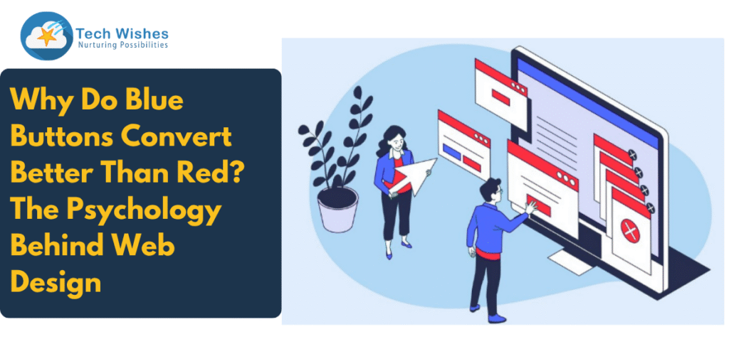
In today’s hyper-competitive digital landscape, website design is no longer just about looking good—it’s about performing well. One of the most debated and tested elements of conversion-focused web design is the colour of call-to-action (CTA) buttons. Surprisingly, blue buttons often outperform red ones, especially when it comes to user engagement and trust-building. But why is that? Let’s explore the psychological science, industry data, and design principles behind this colour-based behaviour, r—and what it means for your website’s bottom line.
As a leading web design company, Tech Wishes helps brands decode such insights to build websites that don’t just look stunning but drive results.
How Does Colour Influence Web Design and Conversion Rates?
Colour psychology studies how different hues affect emotions and decision-making. When it comes to web design, this understanding is essential for creating experiences that influence behaviour, particularly in e-commerce or lead generation websites.
Here’s a quick look at the emotional responses tied to key button colours:
- Red: Signifies urgency, danger, and action. It’s often used in clearance sales, but it can also trigger subconscious warnings.
- Blue: Signifies trust, calm, and professionalism. It’s widely used in fintech, SaaS, and health sectors for a reason.
A user’s perception of a colour, often subconscious, can directly affect how likely they are to click a CTA, stay on your page, or complete a purchase.
Why Do Blue Buttons Convert Better Than Red?
While red grabs attention, studies show blue often wins in actual conversion performance, especially for businesses looking to build long-term trust. Here’s why:
- Trustworthiness
According to several UX research studies, over 60% of users associate blue with trust and security. That’s why platforms like Facebook, PayPal, and LinkedIn use blue extensively. - Reduced Friction
Red can signal danger or error. This perception might cause friction at the moment of decision, especially during sensitive actions like making a payment or submitting information. Blue softens the experience. - Universal Appeal
A Kissmetrics report found that 57% of men and 35% of women list blue as their favourite colour, while red barely made the list. For brands aiming at broad demographics, blue is a safer bet. - Better Contrast & Readability
Designers at Tech Wishes, a trusted web design agency, consistently find that blue buttons (especially when contrasted with white or light backgrounds) improve readability and user engagement.
What Does the Data Say?
- A/B testing by HubSpot found that a blue CTA increased click-through rate by 21% over a red one for a B2B software client.
- Eye-tracking studies show users spend more time focusing on blue elements, especially when the rest of the design is minimalist or neutral.
In the data-driven digital economy, even a 1% increase in conversion could mean thousands of dollars in additional revenue. So imagine what a 21% boost could do for your business.
Should Button Colour Always Be Blue?
Not necessarily. The most successful websites are built around context, branding, and audience behaviour. As the best web design company is not one-size-fits-all, neither is Button Colour.
Here’s what to consider:
- Contrast: Your button must stand out from the background. Blue on blue? Not a good idea.
- Industry norms: E-commerce fashion sites might benefit from red (urgency), but fintech platforms may find blue more reassuring.
- Your brand: If your brand identity revolves around high energy or youthfulness, red may still be the winner.
That’s why Tech Wishes offers tailored, affordable website design solutions, ensuring every design decision, right down to the button colour, is data-backed and brand-aligned.
How Can You Test Which Button Works for You?
As a business, don’t guess—test. Our team of website designers recommends the following:
- A/B Testing: Launch two versions of the same CTA in different colours. Track metrics like click-through rate, form completion, or sales.
- Heatmaps & Scrollmaps: Use tools like Hotjar or Lucky Orange to track where users click.
- Behaviour Analytics: Dive deeper with funnel reports and user sessions.
Tech Wishes, a best-in-class web design company, also helps clients integrate these tools to continuously optimise user experiences. We don’t just build; we build to convert.
The Tech Wishes Advantage: Design that Converts
At Tech Wishes, we combine creativity, behavioural psychology, and cutting-edge tech to deliver affordable website design that gets results. Our website designers don’t follow trends—they understand the science behind them.
From button placement to typography and user flows, we ensure every pixel of your site serves a purpose. We also offer SEO optimisation, custom web apps, and performance tuning, making us the go-to partner for businesses looking to scale smartly.
Whether you’re launching your first site or revamping for 2025, we’re here to help you design for outcomes, not just aesthetics.
Final Thoughts
Blue buttons convert better than red not because of design fashion, but because of human psychology. They build trust, reduce user hesitation, and offer broad appeal. However, the ultimate decision lies in context—your audience, brand, and goals.
Want to know if your CTA colours are helping or hurting your conversion rates? Our website designers at Tech Wishes can run a quick UX audit and guide you on everything from colour psychology to affordable website design that sells.
Let’s make your design choices more deliberate—and more profitable.
Would you like a quick audit of your CTA effectiveness? Reach out to Tech Wishes, your trusted web design company, and let’s get started.
